[iOS] [iPad] 10 minutes of use report

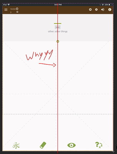
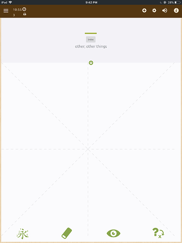
There are many items on screen that feel misaligned, or feel cluttered. Here is the base screenshot I’ll use to illustrate this view:

The items top left are the most obvious

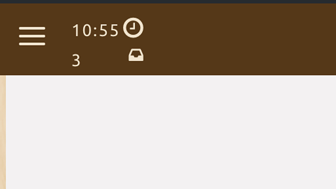
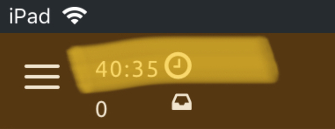
The clock icon, and the clock timer are not vertically aligned, which feels slightly jarring.

Also, the iPad has (relatively) a lot of horizontal space, there shouldn’t be a need to clutter the timer and the review(?) count together. I believe this can be leveraged in a better way by splitting them out to have their own section, side by side. This has the added benefit of making the items slightly bigger.

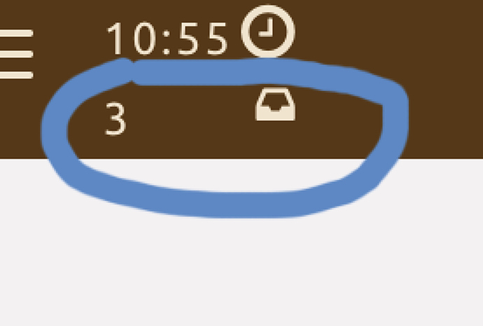
The other part is a slight usability issue, this icon and count:

I can sort of guess, and say “That are probably the items due for study today”, but frankly I’m not sure. I don’t feel the icon or the number is intuitive enough by itself to justify not adding text. Coming back to the fact that we have quite a bit of horizontal space I feel that adding text explaining what the item at hand is would be worthwhile.

Next up, the center of the page is not aligned with the center of the application.

There’s an arrow there, which should be used as a guide if possible:

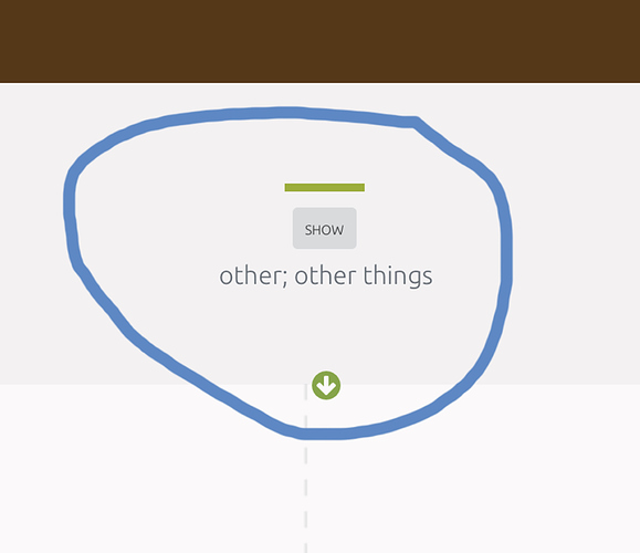
Another potential UX issue is the size of the font for the word definition. I think it’s a bit smaller than it needs to be, and the gray font with a gray-ish background makes the contrast very slightly poor. I think increasing the font contrast, or increasing the font size would be a good idea.

In general though, the application feels unresponsive (I feel there’s somewhere in the ballpark of ~.2-.4 s delay between clicking something, and the action happening), it feels like the writing engine got way more strict, there is no sound as there used to be between transfers (Where your entire word would light up the color you set, then there’s a sound that transitions you to the next word), auto transition to next word seems to take somewhere around half a second to kick in, which feels frustrating (Lack of instant feedback?). All in all I found the beta experience a bit frustrating.

I’d seriously consider delaying the iPad release while you hash out some of these. I am going to be uninstalling, and going back to the normal version for the moment.

I’m not saying this is bad enough that I would stop using the service if it shipped as-is, but it does feel like quite a severe quality impact from the previous application.

PS: The timer apparently keeps counting even while you are in the lockscreen:
2 Likes

@Zyst Can you use it in Landscape mode? Or is it still locked into Portrait like the old iOS app?

Didn’t try landscape at all, I’ve uninstalled and I’m back on the old version for the time being.

Thanks for your feedback, this is great! Device specific optimizations are in the works which will fix up the alignment issues, however some of the things you’ve mentioned like contrast and font size could very well apply to any client (and has been discussed a lot). The timer issue should be fixed in the next release (2.3.6). We’re not planning to push out of beta until these things are ironed out!

Cool, one more thing that would be nice (But in fairness, I’ve seen it mentioned already in previous threads so I assume it might be already in consideration) would be to make the writing area smaller.

I am not using an iPad pro, so the surface writing area itself is not overwhelming, but the previous app had the margins on the left/right side which let you navigate to previous items fairly easily. While trying to click around in the application (To go back and review something, for example) I would just keep getting hints, or triggering the reveal of the current card which wasn’t what I wanted.

The margins are a fairly nice QoL improvement that struck me as something “obvious” that was gone. I can see how the layout would be like this in Phones, since you don’t wanna waste your surface area so that writing is easier, but on Tablets we probably have a bit more leeway.

3 Likes

Great feedback, thanks for taking the time to write this out! We’re working on overhauling a lot of the mobile features right now (which is also why there hasn’t been a beta update for a bit) and will definitely take feedback like yours into consideration.

We haven’t focused too much on tablet layouts specifically yet as our analytics show the vast majority of users use Skritter on smaller mobile devices, but we do plan on supporting and improving the tablet experience.

I sent you 2 feedbacks by email with no reaction. So far I’m back to the old version (iOS).
The newone is poor UX, not able to go back yo review, too small and hard to read. The 3.0 version font is awful.
I love skritter, but so far the old version is the best.

@Tanyya2105 Which email address did you send to? I’ve searched our support inbox and am unfortunately not spotting the feedback you’re referring to.

You can navigate backwards a prompt in 2.0 by tapping the left edge of the canvas (even when the arrow icon isn’t visible)-- we’re also working on UX, and the font/contrast issue has come up quite a bit.

A smaller writing area is a good idea especially if you get a landscape mode working. You could use the extra space for all kinds of cool stats and character information. Would be awesome if you could display Pleco entries next to characters, such as from the Outliers dictionary.

Agree with the rest. Response time, things being too small…

1 Like

This topic was automatically closed 30 days after the last reply. New replies are no longer allowed.