iOS beta feedback from rpetersn

I’ll use this thread to report my feedback for the betas going forward. Any critical bugs that need device data I’ll report via the app, but other feedback I’ll post here to enable discussion.

My setup: iOS 11.4, iPhone X, Skritter for iOS v3.0.5, mainly Wi-Fi

To give a little background, my study needs and process are as follows: I study traditional Chinese as used in Taiwan, and I use Skritter to go through vocabulary lists from textbooks (Integrated Chinese) as I learn the new words. I study writing, definition, pinyin, and tones. For each new character or word, to memorize each character’s form and meaning, I use a combination of the textbook, creating a new mnemonic, and reading the entire Pleco entry (definition, examples, Outlier entry, words containing, components, and compounds). My daily goal is to learn 15 new items a day. To do this, I manually calculate how many new words I need to add from my list to get to 15 new “items learned”, as Skritter counts them in Stats, then add that many manually to the queue using the Add button. Yes, that’s a bit of work, but it ensures I stay on my goal of growing my vocabulary and meeting my monthly goals. My goal is also to get my review queue down to 0 each day. Some of the words in my lists are ones I already know enough to get on the first try, but I don’t remove them from the queue, as SRS takes care of them nicely.

I give this background because it makes it clear what I need from the app besides the basics. I need good Pleco integration, mnemonics per character, stats, a good Add button, etc. Good SRS ordering (works fine in the App Store iOS app) is critical as well.

Before we get to critical feedback, I’d like to say congratulations to the whole Skritter team on a huge win with this beta release. I was one of the ones who sent a long list of feedback with the older betas that concluded that I would not use the app unless there were major changes. This new beta has made those major changes that were needed. It took a lot of guts to throw out all that existing work and start over. Thank you!!

My feedback below is all based on comparison to the current (old but going strong!) App Store version for iOS. I am realizing it is very different than the current website, which I don’t use, so some feedback is for decisions that would date back to building the v2.0 of the web version.

Here’s some of what’s awesome or improved about the new beta from the existing app:

The Good (in no particular order)

  1. The very first startup took less than a minute (I’ve learned about 2,400 items so far). Initial login and sync were flawless for me. The queue size looked reasonable and things just worked from the start. Yay!
  2. The UI design, while very different from the old app and a bit spartan right now with no branding, etc, looks quite nice.
  3. The goal of making the mobile app the priority over website development is really smart. Thank you.
  4. I love the swipe left from edge to open the info page!
  5. The info page has Cards stats now, yay!
  6. Full screen support on iPhone X!
  7. Having an actual on-screen back button rocks! Woohoo!!
  8. Audio playback is available from the info screen. Yay!
  9. Love that the selection for adding multiple words is no longer a double-tap from the + button.
  10. Writing recognition (at least on iPhone X) is pretty broken in the app store version, requiring exaggerated shapes at times. It works much better on this beta!

Below are my most critical bugs and issues. I have a long list of additional less critical feedback that I’ll post tomorrow. Looking forward to the next iOS beta!

Bugs Blocking My Studies
None!

Near blockers - makes my studies painful

  1. Ordering: it is hard to see the pattern, but for some questions, I am getting them multiple times. It seems as if e.g. the queue might be getting reset / not saved when my phone goes to sleep. It is a bit of groundhog day, but it doesn’t always happen. I’ll look for steps.
  2. Ordering: I am getting tone and definition and pinyin questions right after the initial writing. I just saw all of these things when writing, which gives away the answers. They are more spaced out in the iOS app, which seems much better for learning.
  3. Ordering: when I add 10 new words, I expect them to show up in the order they were in the list, as they did in the previous app. This is important because you want e.g. the words from your current lesson to be shown before the ones from your next lesson. Right now they come in scrambled in random order.
  4. Ordering: for new words, it is often asking for pinyin, etc, before asking for writing. I preferred the previous app where writing came first (otherwise I haven’t learned how to read the new character yet).
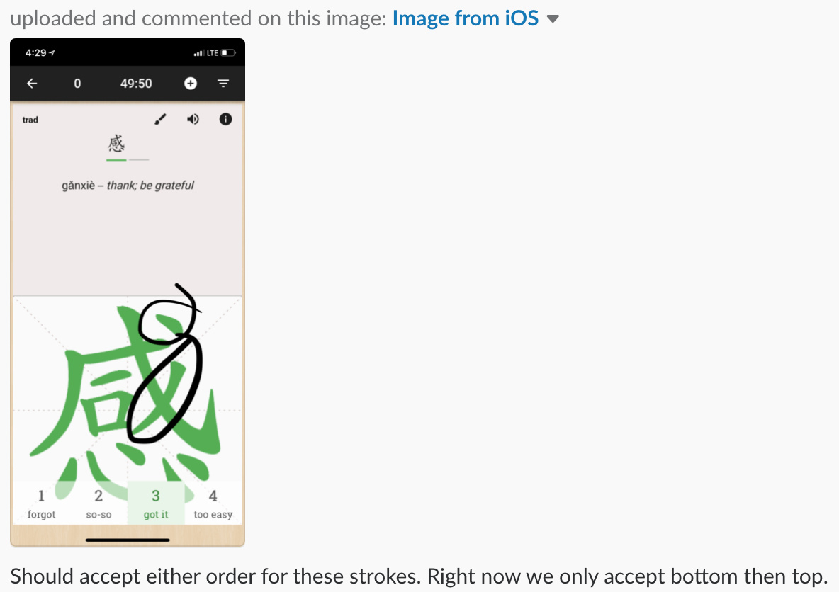
  5. Straight vertical and straight horizontal strokes are not being detected correctly. Specifically, you can start drawing it straight and then continue on to make practically any stroke you want and it will be accepted. I sent a bug report about this from the app for a specific case, but it turns out to be a general problem for seemingly all vertical and horizontal strokes, and to some degree true for other strokes. This can be reproduced on the Quick Test as well as Study. Bottom line is that there is something really wrong here — I have written entirely the wrong character and had it accepted.
  6. More often than not, bug reports from the app fail to send when attaching an image. I reported this via the app. It seems like some images are less likely to work than others (?) although it is always a screenshot. Let me know if you need more info. The most critical bugs often require screenshot uploads, so this seems important.
  7. If you give yourself a grade while auto-advance is counting down, it cancels auto-advance! This made me turn off auto-advance out of frustration. Grading should not count as canceling auto-advance.

Other major concerns

  1. I also get the frozen writing area sometimes that was mentioned in the release notes, particularly on tones but also on writing characters.
  2. The whole screen flashes sometimes, flashing to white and then after a bit, redrawing. I don’t know the steps to repro, and it seems to happen intermittently, mostly when on the main screen, once every few minutes. Let me know if you are not seeing it at all and need a video.
  3. Per-character mnemonics when studying multi-character words are missing. This is probably a discussion, because it seems to be missing on the web version as well. I have been using mnemonics heavily on the iOS app. Each time I study a new word, I add have to learn to write each character in the word. To do this, when writing, I often add a mnemonic for each character based on the components of the character, etc. This mnemonic follows the character, so when writing another word with the same character, I can see it again if I need it. On the web and new beta, if you are writing a character for a word, only the character-level mnemonic is visible. I happen to never use multi-character word mnemonics (perhaps because they are not easily accessible in the iOS app, but also they are less useful because I already have mnemonics for each character). So the current implementation seems completely backwards to me. As a result, the hundred-plus mnemonics I have created are completely inaccessible to me now. :frowning: On top of that, I have no way of adding a new mnemonic without going to the web and looking up individual characters. If this is an intentional design decision, let’s discuss. I’ve thought about it for a day or so and am pretty sure that per-character should be the priority. I could see it being less important for people who first add all the individual characters before they add words for those characters, but that seems pretty inefficient for me to switch to.
  4. UX feedback: Auto-advance: this is probably another discussion. The auto-advance behavior is quite different than in the iOS version. I know I am used to the iOS version, but I think it got auto-advance right. It auto-advances after answering a tone or writing question because those can be graded by the computer. It waits until you score yourself for tone and pinyin, because you need some time to give an honest score. Furthermore, if you tap a grade, it will then auto-advance, so in effect you always get auto-advance after the grade is assigned. In the current app, the self-scored questions also auto-advance, discouraging changing the grade. Honestly, I know I often need a moment of reflection to give myself the right grade rather than just letting it go, so this is not ideal. Not having auto-advance on the computer-graded questions is also quite frustrating, so turning the auto-advance feature off is not a solution. My recommendation is to go back to the version of the feature in the current iOS app, as that workflow was very fast and fluid.
  5. Beating a dead drum :wink: …Pleco integration! As I described earlier, reading the Pleco entry is an essential step of learning every new word or character for me. I only put it this low on the list because I know it has been talked about too many times already.

That’s it for major concerns! I’ll post the list of smaller things soon. Thank you!

3 Likes

I concur on the difficulties with the auto advance. I liked the way the old iOS app allowed you to stop the auto advance from happening, by touching the character. There doesn’t seem to be any way now to stop the auto advance if you want to pause and consider your grade and if you want to change it. And I don’t want things to advance the moment I enter a grade…I frequently reconsider and change the grade.

I found it interesting that writing the character first was something that you liked. I actually found the opposite, And it was one of my biggest beefs with the old iOS app. From my perspective, since I don’t know the character yet, nor how to pronounce it, nor its meaning, I found the writing almost impossible to do first and would’ve rather had the writing show up much much later. I would prefer NOT to see it until I learned the meaning and the pronunciation. So, very different learning styles.

1 Like

There is so much great feedback in here. Thanks! We’ll need some time to dig into all this great feedback, but I did wanna address auto advance quickly since both of you mentioned it. I made a new post that explains auto advance behavior, here

I also posted a video on YouTube talking about much of the same stuff, which is here:

We’re willing to adjust and making changes to behavior, but we wanna makes sure that we have a clear path forward before doing so. I hope the topic and video help explain how it’s working in the app right now, and we look forward to making some changes in the future if that is what works best for the majority of users.

-Jake

1 Like

We’re using Help Scout’s beacon as the third-party service for the contact button. It’s possible that there was something going wrong on their end. I just uploaded two images and one video using the contact page in-app without issue trying to reproduce.

Please let us know if this is still going on so we can investigate further. Like you said, bugs often require screenshots. If you do run into issues with the contact screen you can always post on here or email team@skritter.com in a pinch, too.

We still see this bug, but we haven’t been able to reproduce it at will yet. I’ve tried so many different combos, but no luck unlocking the critical point of failure.

If don’t have this fixed by early next week we’ll be opening up a bounty on this thing and giving away some free study time for whomever can identify the breaking point.

1 Like

It seems to be 100% reproducible with the first screenshot I tried to send, but not with a few others I’ve tried. I just sent the screenshot to team@scritter.com. That screenshot doesn’t seem different than the others, but maybe it is some interaction with iCloud photos. I have iCloud photo on, but my iCloud storage is full so that image (and the others I’ve tested, however) are not uploaded. shrug In my experience, bugs happen around iCloud images, but that is just one conjecture.

Are specific examples of this useful? I paid some attention today, and I several times got two different questions for the same word within 5 minutes of each other. Examples:

  1. 太極拳: pinyin asked for, then 5 minutes later (2:44pm today PDT) tone was asked for
  2. 機會: definition asked for, then 5 minutes later (2:48pm) pinyin was asked for
  3. 營養: definition asked for, then 5 minutes later (2:49pm) pinyin asked for
  4. 飽: pinyin asked for, then writing 20 mins later, then tone 5 minutes later (3:53pm)

In these cases, these were not new vocabulary. Also, there were several instances where the cards were about 1 hour apart.

My concern here is that 5 minutes is not enough time to forget the answer seen on the card before.

Next build! I’m internal testing with it in the app right now and it will be in the next update (v3.0.7)

2 Likes

I can now reproduce the frozen drawing area. I have auto-advance on (in fact, all of the quick setting filters are on). On a multi-character tone card (as an example), after writing the first tone, double-tap the grade right before it will transition to the next card. I can reproduce it about 50% of the time doing this.

Should be easy to repro with a bunch of long words set to review tones. Note that the double-tap doesn’t have to be fast, I believe it just has to be taps or multiple taps right around the card transition time.

1 Like

Thanks! I found it today doing almost exactly what you described as well. Josh is able to reproduce and we’ll work on a fix for 3.0.8 update. Not going to make it in the next Apple approved build, but we’ll get it taken care of.

Appreciate you putting in the time to help track it down!

1 Like

Ok, now for the remainder of my bug/feature request/feedback list. This is roughly in my personal priority order, most important to fix first. I upgraded to v3.0.6, but my other details are the same as above.

  1. Fixed! Thank you for making the study button bigger! It was hard to reach at the top right corner.
  2. Hidden pinyin and definition are no longer revealed after you answer a question (I have both hidden). This sounds minor, but I used them for review, e.g. to review the definition after answering the pinyin. I always study all of the parts briefly once I answer a question, so I miss this quite a bit.
  3. Sounds: when writing a word, it no longer says the character after each character is completed. Same for tones. This was very helpful for reinforcing the correct pronunciation, particularly when studying the tones.
  4. Info screen: you can no longer tap into individual characters on the info screen to drill down. This was super useful, particularly to display the stats about that character (whether it is new or not, how many times you have written it, etc). It also doesn’t show the definitions of each character, but if I were able to drill down, I could probably live with that.
  5. The coloring of writing after grading is inconsistent: not after the computer initially assigns a grade, the squigs and character stay gray, but if you tap on a grade to change it, the raw squigs get colored. The (non-raw) character is only colored if you go back. But then the squigs are not colored. I would expect the squigs or character to change to the grade color each time you complete a character and change again each time you change the grade.
  6. Related, how the drawing area looks when you go back is not consistent. If I go back from one word to a previous word, it shows me a gray character with my raw squigs on top. If I go back between characters in a word, it shows me a colored character (depending on the score) with no raw squigs. Then going forward again clears the squigs and shows the colored character.
  7. Related, I find the indicator for which grade I got after writing is too subtle. If the character is colored when grading, this will be solved.
  8. The characters displayed at the top of the screen are also no longer colored after they are written. Previously you could see which characters you got right without having to go back and check. If writing a word of many characters, this is particularly useful, but also good for verifying auto-advance didn’t leave a grading mistake.
  9. Sounds: missing sounds for the major actions, like answering a question or when adding a word completes. The biggest one I miss is the celebration sound when the queue gets to zero.
  10. Going to the main screen and back to Study often changes the word I was working on. This is disconcerting and often I lose the word I was working on. Steps to reproduce: go into Study. Start studying a word by e.g. writing the first character. Go back to the main screen. Hit study again. Observe: a new word often (but not always) has replaced the one you were just working on. If the same word is there, the characters you wrote are gone.
  11. Sometimes writing the third stroke of 氵 (i.e. 三點水旁, the left half of 沒), it clears the screen. I know that in this case I am writing it a little too vertically, but even though that is my mistake, it is still frustrating. It seems that even the smallest upward stroke that is more than ~45 degrees will trigger a clear of the screen. Maybe make the stroke need to longer or more vertical?
  12. Tap and hold to show the character: I thought this was a good idea until I started having the character inadvertently shown because I pause briefly while stating to write a stroke with my finger on the screen. I pause because I am considering my stroke. This has happened several times in the last few days and invalidates the question since I was given the answer. Not sure how to solve this other than changing the gesture. Suggestion: change reveal to a two-finger tap. Thus the taps would be: one finger tap to show one stroke, two finger tap to show all strokes, and two finger hold to enter teaching mode.
  13. It takes awhile for the app to update the main due count when changed outside of the app, and there is no visual indication that it is out of date. Moreover, when the visual indication that the app is syncing completes, it is still out of date. Steps to report: note the due count, leave the app, and go into the app store version of the app. Note that the due counts are similar but not the same (this is not the bug). Study 10 items, then switch back to the beta app. Wait for the main due count to update. Observe: the main due count takes more than a minute to update, despite the blue progress line at the top refreshing once in awhile. Note that the website updated right away (after refresh).
  14. The playback sound quality is bad in some cases. There is often background noise and/or distortions during playback. One word that does this for me 休息. If you play multiple times, one version has background noise and the other has distortions.
  15. Bold and italics in mnemonics are not yet supported. I use these all the time.
  16. Sometimes the writing area clears when I go back, requiring me to rewrite the character I’ve already written. The steps to reproduce this are: find a two-character word, write the first character, start writing the second character, swipe up to clear the second character. Now if at any time you go back to the first character, you will find it also has been cleared.
  17. Card transitions: The transition between cards during Study, after answering a question, is often very subtle. Sound would help here but also some type of subtle animation to indicate that you are moving to the next card.
  18. Menu transition animations: Going back from settings or other items in the menu bar doesn’t land you back in the menu where you’d expect. Instead it puts you back in the main screen. This would be fine but there is no menu close animation to tell you that that happened, so it is jarring to have the menu gone.
  19. Lists: tapping into the lists on the main page, they list the % complete, which I love. I’d like to see this on the front page. However, there is a bug that shows my completed lists as 99% complete. E.g. my HSK 1 list on my account.
  20. Lists: while we are discussing lists, I’d really really really like to see the % complete for each section, and then whether each item has been added or not when you drill down to the actual characters. :pray:
  21. I am not getting warnings about backwards lines or missing hooks. It seems to not allow backward strokes (fine with me) but it does allow missing hooks with no warning now. I found the warnings very useful, as leaving off the hook is incorrect.
  22. Time Studied on the main screen does not update immediately when you come back from Studying (but the due count does).
  23. Swipe gestures: The feel of the right and left swipe-from-edge gestures (to open the menu and the info page) are very non-native feeling and janky. I know this isn’t a short term priority, but they feel really broken right now. They don’t even appear until you lift your finger. Compare to Mail or Pleco or any other iOS app that has native swipe-from-edge UI. They should look and behave exactly like normal iOS swipes.
  24. The drawing of the individual panes when you drill down in Settings stutters significantly on an iPhone X. Steps to report: go to Settings, tap Username. Observe: low frame rate as the panel slides in. Repeating this immediately gives a smoother animation. Repeating it with another setting shows stuttering again.
  25. In raw squigs, if I write half a character and go back and then forward, the raw squids are replaced by non-raw strokes. To reproduce: fine a two character writing question, write the first character, write the first few strokes of the second character, then go back to the first. Finally grade the first again. Observe: the second character is shown but your raw squigs are replaced by non-raw.
  26. Sometimes swiping up to erase reveals the first stroke of the character to write. To reproduce, go to a writing card, and swipe up several times. Once in awhile, it shows the first stroke.
  27. There is no longer a way to set the grade for a whole word, just the individual characters. Is this information no longer used? It was possible in the previous iOS app.

**Design Feedback **

  1. As someone else mentioned, on the study cards , I’d like to see the Chinese characters displayed larger. They can dynamically shrink if there are lots of them, but by default, I like the size of the old iOS app for ease of reading. I guess I’m gettin’ old. :slight_smile:
  2. Characters on tone cards too small: when the tone question is asked, I prefer that the characters are the main focus, not the pinyin as it is in the beta. It is better practice to read the characters than the pinyin, and when you have pinyin and definition hidden, you can’t tell what tone to use without reading the tiny characters below the hidden pinyin. You need more than just the one character in the writing area because of tone changes.
  3. The app looks like an Android app in some areas. On iOS, this feels really awkward, especially the menu and settings screens. What percentage of your paying customers are iOS vs Android? If it is less than 20% iOS, I could imagine this making sense, but that seems unlikely. The study screen and main screen are so custom that they are less of a problem, so at worst case I’d shoot for that.
  4. The strokes using raw squigs look nice, but they look a little low res (some jaggies) and they change once you finish writing (still jaggy, but somewhat smoothed?). It is close and some work could make them really look good. :slight_smile:
  5. General design polish like Proxi mentioned will really help the app look great for the full release
  6. I agree with Jake who said that the gray font-based character that is overlaid on top of the raw strokes that the user makes should be more subtle or otherwise less dominating on top of the user’s strokes.
  7. Nit: Could we change “raw squibs” or whatever the menu item is to “raw strokes” or “user strokes”? No one knows what a squib is. :slight_smile: I think a lot more people would use their own strokes if they knew it was supported.
  8. Nit: The black (dark gray) of the top of the app and the black of the status bar don’t match, for iPhone X. On iOS they should. Pick one or the other. Overcast is an iPhone app that has three themes including dark gray and black, if you want to see what the two options would look like.
  9. Nit: “Definition” is shown in red while “Pinyin” is shown in blue. The blue looks great but the red looks like there is an error. How about green for Definition?

Feature Requests

  1. Stats I use the Stats website page every day. Here’s what I’d need at a minimum: all-time total #items, characters, and words learned. Lower priority: In addition, I’d love to see my streak (and please make it not reset each month!) and the current calendar as on the website (please make it start on Sunday if my locale is set to the US!). The others are nice to have for me, but I love interactive charts, etc.
  2. Lists: It was mentioned that the lists in the main view will be sorted differently in the future. The sorting on the website works best for me, with sections for Adding and Reviewing.
  3. Words: I could really use search in my list of Words. My main use case is checking if a word is already in my study list.
  4. Words: I’d like to see Words sorted (or sortable) by last seen, like on the website.
  5. Add: I know this sounds weird, but since I am adding an arbitrary number of words each day (to meet my items goal), my ideal set of + options would be “1,2,3,4,5,10,20”. Currently it is “1,5,10,20”. The former would allow me to add whatever I need in three taps or less.
4 Likes

I don’t really know what to say about the above, other than thank you! This type of feedback is really, really appreciated. I don’t know how much time this took you to write, but we’ll be using a lot of it as a roadmap for continued improvements, especially for iOS devices. Josh actually just got his hands on iPhone X and 2018 iPad for testing and development builds, which will help things along immensely.

Without going line by line through the list (at least for now), I’ll just say that most, if not all, of your points, are valid and we are either already working on them, or they’ll be seriously considered.

At the moment, Josh and I are the two primary team members working on the Skritter Mobile app, so some things might take some time. Michael and a lot of the other team members have been working hard on other projects, but they’ll be diversifying time and energy to help us continue to roll out updates.

Regarding design feedback-- thank you for all the suggestions! I’m currently taking point on the design of the app, and kinda learning as I go. I have a more detailed reply about that here, which goes into our team’s current design situation and future plans.

I’ll be commenting on some of the specifics later, but I just wanted to take the time to say thanks for posting this up! Have a great weekend and stay tuned for more updates. 3.0.7 was sent to Apple yesterday and once it is approved for release we’ll send it out on TestFlight and get to work on 3.0.8 :slight_smile:

-Jake

1 Like

Dear Skitter Jake,

Please find my feedback below:

  1. Generalities
    My config: iPhone 8 Plus (MQ8G2ZP/A) - iOS 11.4 (15F79)
    Location: China, Shanghai
    Tested with and without VPN

It is a very good beta here. Much better than all of the previous. Thank you for the amazing work. Can’t wait to see this beta growing. And I am generally enthusiast to see the path Skritter is taking with all the Youtube Videos with all the explanations and other.
However, I think there is a long way to go to match the quality of the original app but it’s on the good way.

English is not my native language so please forgive the general writting quality of the following.

Finally, I know some of the issue addressed below received a reply on other people but this was written before I took a look at the forum.

  1. Lack of friendly sounds
    The sound is missing ! All I can hear is the pronunciation of the words. I feel pretty lonely when I use Skritter. The app seems much less friendly.
    I think it is necessary to add:
    “Woosh” sounds of the brush when writing on the canvas
    “Easy” “Correct” “So-So” “Forgot” grade sounds
    “5min” “15min” etc… encouragement sounds
    and in general UI sounds when clicking on a button etc…

  2. Lack of pronunciation breakdown.
    On the old app, when I was studying the writing of “很好”, once I finished writing 很 the app would pronounce only 很, then when I finished writting 好 the app would pronounce only 好, and after, the app would pronounce 很好.
    Now the beta app, only pronunce 很好 without the pronunciation breakdown of each hanzi.

  3. Sound is delayed
    The pronunciation of the hanzi comes to late. Sometime the pronunciation is coming to late and the app has already moved to the next study card. So for example if I have to study the writing of “很好” once I input the final stoke the auto-advance starts and last for 1.5 sec and after moving to the next card, the problem is that the pronunciation seems to be set to 2 sec. So the pronunciation for “很好” comes after the study card and is pronounced on the next word study card witch is confusing.

  4. Android app look and feel
    It is very strange to have the look and feel of an Android app on the iPhone.
    I think you should use more “iOS visual elements” in your app.

  5. Input the stokes and setting difficulty
    I really like the new input of the stokes.
    However, I think you should add a setting to change the “forgiveness” of the stoke recognition. Sometimes, I don’t really remember how a hanzi is written and if you try to write a little bit randomly, most of the time, the input is accepted.
    It can be useful when you are learning but as I really want to know how to write, I would like the stoke recognition difficulty to be customisable. Maybe in the same way as it is possible to set the retention rate.

  6. Size of the font
    Is it me or the font used is very very small ?
    Especially on iPhone Plus screens, there is soooo much space waste.
    And this space waste is emphasized by the color choice (mainly white + flat design) and the lack of sound which result in a feeling of emptiness.

  7. SRS behavior
    When I launched the beta and used it for the first time, the beta was asking me words that I didn’t reviewed for 8 months or so (when I started Chinese).
    So I ended up reviewing words such as “很好”, “老师” or “你好” and on the contrary, all the words that I really needed to practice (added only few hours ago) were not reviewed.

2 Likes

Thanks so much for your feedback, this is great! We’re looking this over to take into consideration. We’ll touch on the points you’ve mentioned!

You’re welcome! As for the time taken, noting down what I see doesn’t take much time, although putting it into coherent feedback does take a bit. It is worth the time to me because I’m putting a lot of effort into Chinese currently and Skritter is my most essential tool for that. :smile: I’m lucky to have some more time these days, currently semi-retired from building teams to build smartphones (in the past) and mobile apps (Facebook Messenger Kids and Moments most recently), so putting it into my learning tools makes some sense.

I have some more minor bugs to send, but I’ll check them out on 3.0.8 first.

Best thing about software development is the need for new devices. :wink:

Awesome, sounds fun! Design is a tough vocation because everyone has an opinion, so that’s brave of you to take on. :smile:

3 Likes

My latest feedback from testing 2.08 and 3.0.9 (all bugs verified on 3.0.9):

  1. Auto-advance: generally this is working better for me. The biggest problem is that it is far too slow for “got it”. I used to use 0.9s advance, and now it is defaulting to 66% slower than that. I need to be able to set the duration to make it work for me. This is the biggest reason the new app feels slower for me. On the good side, tapping on an answer to auto-grade it as correct and instantly move on is really handy.
  2. Strokes not working in the drawing area is still happening. Happens a lot when going back to the first character after writing a second character and getting it right. One repro: come back to first char and double finger hold to start the tutorial drawing. Also happens when hitting back quickly after the card advances. It also happens sometimes when moving forward. It feels like it is happening more often now.
  3. It is possible to accidentally skip a question by tapping a grade right before switching cards. It grades the next card even though the grading buttons are not shown (e.g. for definition and pinyin cards) and then auto-advances.
  4. Strokes are still being accepted even if they are written very incorrectly. You can often almost write a different character and get it accepted. I reported it previously, but let me know if you need more info on this.
  5. The auto advance timer doesn’t stop when you hit the back button. It will still complete and move you forward even after you moved back. To report: grade a card, and while auto-advance is counting down, hit back. Observed: goes back one card, then when auto-advance completes (note you can no longer see the progress bar), it goes forward one card. Expected: auto-advance is cancelled if you move off the card.
  6. The Writing count in the Cards section of info seems to get updated incorrectly on the client. In one instance, it said 1/3 (33%) for 動作 (same as the website). Then I wrote the character, then went back to that card right away. It showed 4/6. However, the website showed 2/4, which seems correct.
  7. Adding new words manually is not a great experience. It is very slow, especially on a list that has many words I already have in the queue. Since it is fully done in the background, and has no status until it is fully done, I feel like I can’t leave the app and don’t know when it will finish until it is fully done. Suggestion: add status at the bottom where it shows “20 added”, but show it during the progress instead of only at the end.
  8. Feature request: include the simplified version of the character in Info even if I’m only studying traditional. This is pretty important to my study.
  9. I assume this is a known issue, but starring doesn’t work for me. Cannot enable or disable the star for a word.
  10. The time and due number at the top of the screen are tappable but don’t do anything. I would expect them to not respond to taps
  11. Note that when there are no new words to add, it is a lot slower to fail to add 20 words versus 1, so it is doing extra work and not short circuiting.

Other notes:

  1. The up-stroke on 三點水 no longer erases the card, yay! I saw someone report that casual upstrokes no longer clear the card — this is good, because it was clearing the card when writing the third stroke of 三點水 if you were not careful to get enough angle on it.
  2. The order of cards is still bothering me a lot — I’ll get card just a few cards after one that had the answer to the new one (e.g. a pinyin card a few cards after a tone card).
  3. Mnemonics still do not save. I only mention this because I think I saw it mentioned that this was believed to be fixed. I tried saving a mnemonic for 話.
  4. In earlier versions, adding a word when there are no more available never gave up searching, but it seems to be working fine now.
  5. Banning also seems to be working for me now.
  6. As others noted, auto-add of new words is not working. I have to add new words manually.
  7. Contained characters still not usually showing up. Is this expected? The feature seems to usually not show all characters.
  8. The reordering of cards each time I go out and in of Study is still bothersome, particularly when you are in the middle of a question and you lose it.

I’m loving the updates and seeing the fixes roll in. Let me know if you prefer a new thread for new bug lists like this.

We need specifics so we can adjust strokes on a character by character basis. Or at least a stroke by stroke bases, which is how our system works. Sending general feedback for this stuff is probably a huge pain and a huge ask.

We plan on addressing this at some point in July by providing a feedback button on the vocab info screen that will give you a few options of issues to report on

  • bad audio
  • stroke order issue
  • bad stroke recognition
  • definition error
  • official example sentence error

This kind of feedback should let us fix things very quickly in batches. And it’ll be a lot easier for you and others to report. Until then, grade a little stricter than you think you should, and take some notes if you feel like it. Here is how I’m keeping track at the moment:

I take a screenshot of the character with the bad strokes circled for quick reference later. I was focusing on the stroke order for this one, but you get the idea. I’m dumping mine to Slack so the team can see them too, but even an email dump of screenshots like this with a little context could certainly help us dig into the issue a lot faster, and help give some insight into the types of things we should be looking for in future testing.

I’ll be adding some more comments to your detailed report a bit later, but this is something we already have a plan for, but it isn’t going to be included in the next few builds, so I wanted to separate it into its own reply.

Thanks for the great feedback, again!

-Jake

1 Like

A skip button and auto-advance speed control are coming soon. Not sure what build, but we have plans for both to return as soon as we can get to them.

I think this is now fixed in 3.0.11

We have to tune. Raw squids need love. We will focus on this more once we deploy the new feedback system so we can batch fix.

Will investigate and open an issue if we haven’t already fixed this in 3.0.11

Will investigate and patch up. Good find!

I have this report and some other feedback tagged under UX/UI stuff. Expect improvements before official release.

Coming back soon. We are working on making vocab info better this week.

Issue is open for if. I hope we can fix along with other vocab info stuff we are working on.

Good catch. Will open an issue.

We’ll investigate. @josh this seems like something you’d understand in the code much better than me.

Things are generally ordered by due value. I also think that this is a part of the hide button debate a bit in the other thread. At some point down the line when things are stable we can also look at scheduling with a fine tooth comb. For now, I think we have to just say sorry for the reviews. It’s all in the queue so you’ll be learning them at some point, but I do get that having things come too close together is annoying. This also might be a part of some other issues that Josh is fixing. Keep an eye on the spacing in 3.0.12 and let us know if you noticed any improvements

Issue open. Will be a part of vocab info update if we can get it in there.

Issue is open for this. Hope to fix it up soon.

@josh you know this behavior a lot better than me. Thoughts?

歐買尬,best quote ever! Needs a t-shirt.

1 Like

Re the batch feedback system, note that they are stroke-level issues that I am seeing, not character-level issues. I sent more info over email a few days ago along with videos.

Yes, studying one thing on one card does make this a bit better. But it still seems inefficient to e.g. ask for the pinyin for a card literally 30 seconds after it was revealed to you on a tone card (tone cards always reveal pinyin). Agreed that there are other things to fix first – my workaround is to study by card type now – first e.g. writing, then pinyin, then definition, then tone.

Thanks for all the detailed responses!

1 Like