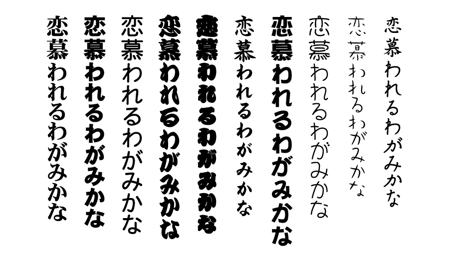
There is a related issue: Character font/display, but on the opposite, I would prefer all Chinese characters to be written in HeiTi-style fontface, i.e. San-Serif (instead of current KaiTi) everywhere except the drawing area.
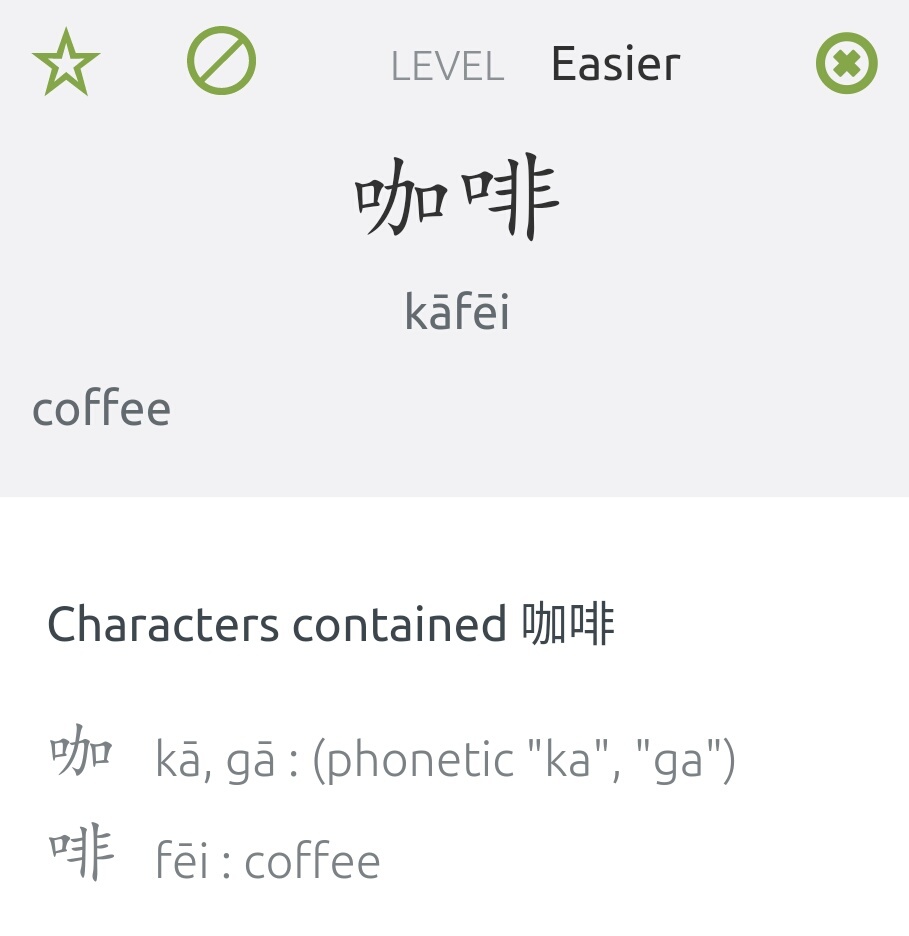
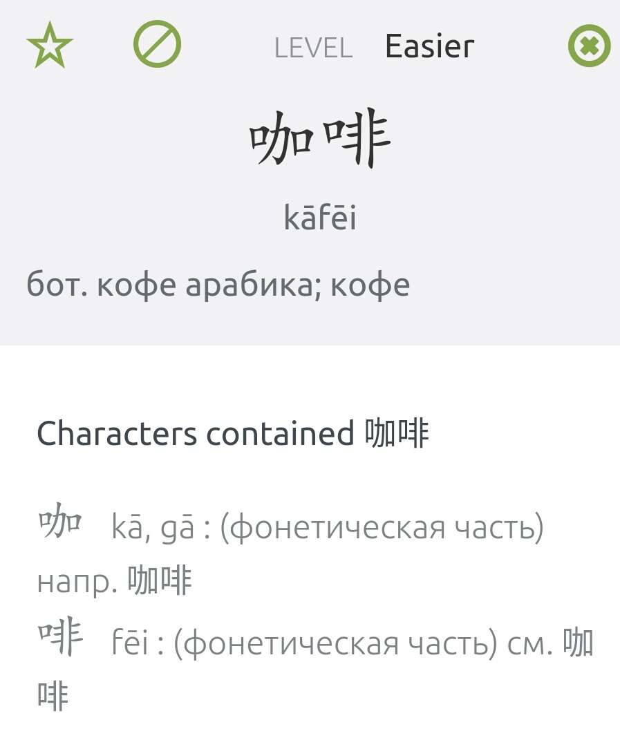
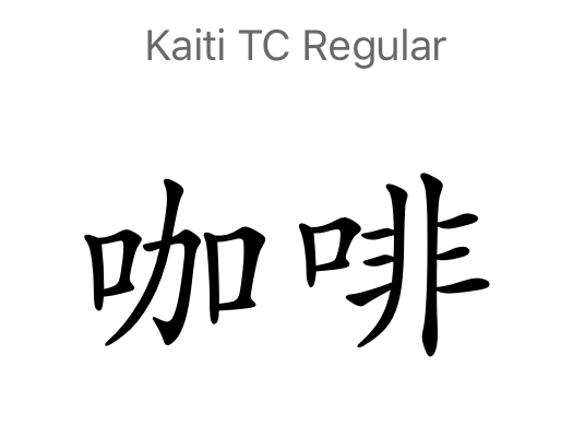
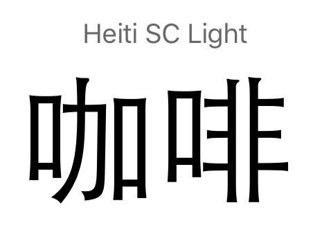
The reason is that the wast majority of Chinese that I read is written in HeiTi-style. And when I learn the words only in KaiTi, I just have troubles later recognising the same characters in HeiTi. Compare for example the word 咖啡: in sans-serif 口 radicals are stretched and the word looks much more dense.
This is probably not the best example, but I just wanted to show the significant visual difference, which is even more noticeable when reading a text and needing to think how the character is spelled to remember that you actually know it.
I suppose some people won’t agree with me, so it would be nice to have a setting where user can choose preferred typeface.
P.S. There is a wonderful sans-serif open source font with the full CJK characters set: Source Han Sans.
Coming from a Japanese background, I feel I can’t weigh in very well. Since Japanese is kana dense, even when kanji are scribbled poorly or blurred to the point of almost being unrecognizable, it’s still legible especially based on context, also many different fonts are often used in computer text, so while some fonts are used a lot more than others (and especially for things like news print), there isn’t really a locked in expectation.
Does Chinese font text pretty much always use the Heiti font style like in books, websites, and newspapers, where Kaiti is more close to textbooks/calligraphy?
Edit
in the meantime, you might be able to install a custom CSS extension for your browser, to change the font-family on the site, and specify it to HeiTi only.
I see that in Japanese the situation is different. That’s why I suggest a setting/option, not a general change.
Does Chinese font text pretty much always use the Heiti font style like in books, websites, and newspapers, where Kaiti is more close to textbooks/calligraphy?
Yes. I asked my Chinese friend to reassure this. KaiTi-style writing is used only in copybooks and in decorative typesetting. All other texts are in HeiTi-style.
in the meantime, you might be able to install a custom CSS extension for your browser
But I use Skritter through the Android app. Is there a workaround for it?
EDIT: I should correct myself: most of the texts in Chinese are either in HeiTi or in SongTi, which are still rather similar (sans-serif and serif correspondingly) and both significantly different from KaiTi.
I personally disagree with you @laughedelic . The reason is, that different fonts aren’t a problem if you know how to write the character. If you only focus on reading / recognizing a character I can see that it is a problem, but Skritters main benefit is helping you learn how to write characters with an SRS.
You will always encounter different writing styles in a real world environment, be it Handwriting or special fonts that are pretty.
@argead I don’t really get what are you arguing about. Skritter helps you to learn correct writing or the characters Knowing how to write a character is enough to recognize it for the first time written/printed in an unusual script/typeface
But this is totally different from fluent reading. When you read a text you don’t write it in your mind, you percept characters (or words in an alphabet-based language) as minimal visual blocks.
I want to use Skritter to train myself in both things. And I see usage of a HeiTi-style font just a more effective mean (again, for myself) to train characters recognition for the majority of the real-world usecases (i.e. printed text, web-pages. etc.). You may have a different personal preference regarding the font, that’s why (again) I ask about a setting, not a global change for everybody.
@Jeremy Another argument in favor of such setting is the interface consistency. The current beta version of the Android app uses both fonts. HeiTi (system) font is used in the interface and definitions:
I would definitely switch to Heiti for Chinese if given the option. Studying from Kaiti hasn’t been a big impediment, but nearly all of my reading material is Heiti.
I agree with the request. Having the option to switch to a font more commonly used in print would be useful.
Since I’ve started reading books in Chinese, I’ve noticed that there are characters I can read instantly in a printed text, but struggle to recognize quickly in the skitter app. That’s not ideal for practice.
And reading and writing do use different parts of the brain. There are a few hundred characters I read easily but wouldn’t know how to write (the same way that there are English words you’d have trouble spelling but no trouble reading).
I was about to post the same thing. As a new Chinese learner, I’m finding Skritter very valuable. But my experience transferring my reading skills to literally every other app or situation has been that I don’t have any instant recall of new letters. I can break them down into components and remember what they mean, but there is a big lost opportunity to train that instant recall in Skritter.
Given the age of this request, I will probably do this by overriding the styles in my browser.
I also want a font setting, or ability to specify font, (such as with Pleco). I’m currently using the MOE traditional fonts for Taiwan in anki, but if I could use those in Skritter that’d be great!
Hi @Jeremy! Is this still on the backlog? This topic is unlisted, so I’m not sure if my reply revives it or I should open a new one. It seems though that you agreed with the usefulness of this feature, but I can imagine that over time it fell through the cracks.
 Knowing how to write a character is enough to recognize it for the first time written/printed in an unusual script/typeface