Using Chrome Android 7 Samsung s7
Used to look great, now it’s a bit strange.
There’s an app available in the Play Store which is optimized for the screen, you can opt in to the beta for a similar study experience compared to the 2.0 web version!
Thanks, yes I’m using the app too. Just wanted to try the web version again as it has zhuyin now. Thanks for your reply.
@russell359 I opened a bug report to try and get 注音 to correctly display on the Android beta app. Keep an eye on development notes for when we have things patched up.
1 Like
Actually I’m wondering why you changed the new website so that it’s no longer compatible with mobile screens, it used to work fine, you just had to press a button and the right pane would pop into view, now the right pane is permanently enabled. Just wondering why this was done?
Hmm, would you be able to upload a screenshot? Though if you’re on an Android device it makes sense to use the Android app and the same with iOS, it should still display (roughly) fine on the browser as well depending on the screen size. (The mobile apps are designed for the mobile screens where the website is intended for a computer).
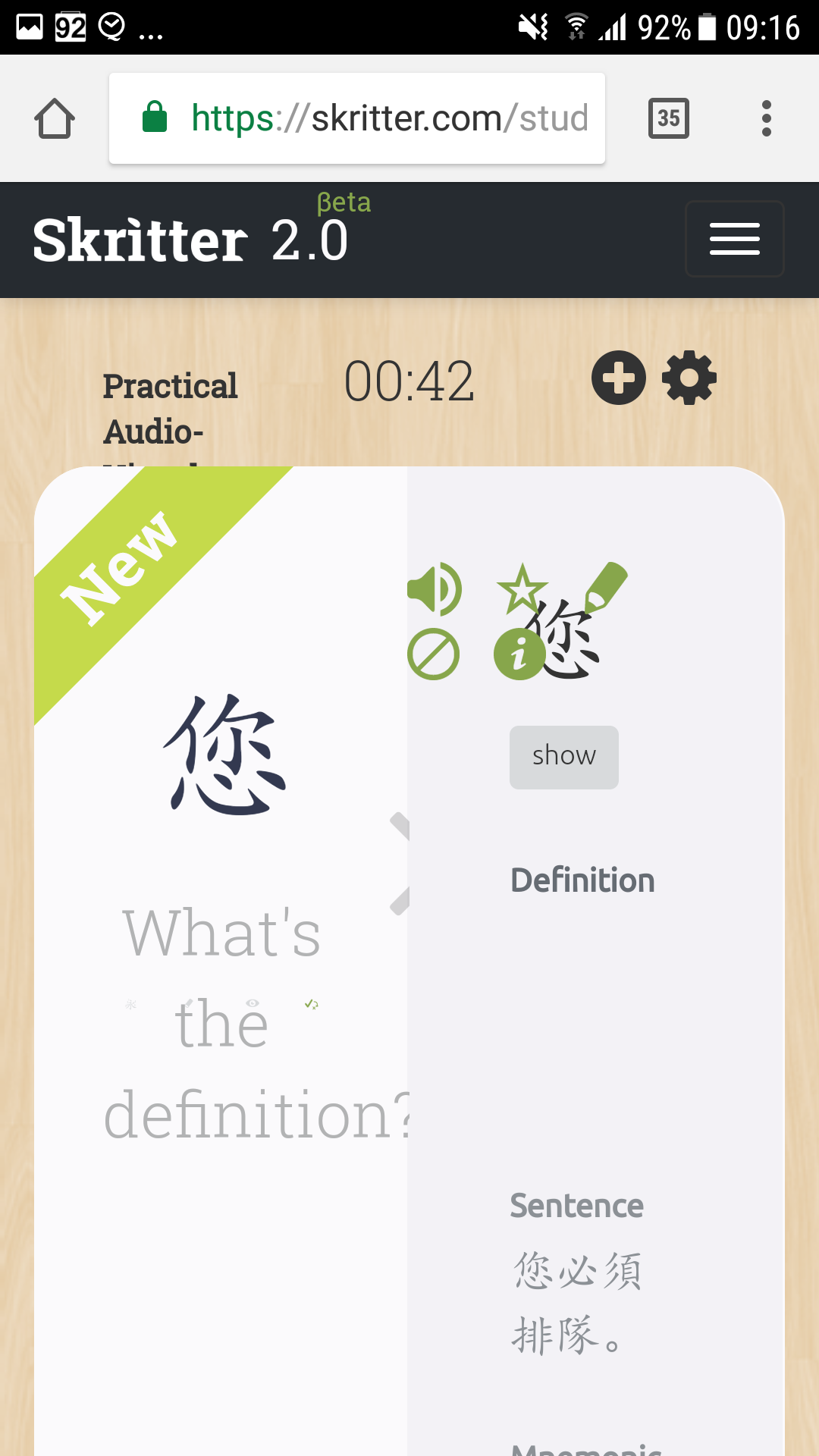
Hi, yes, there’s a screenshot up above, in the first post. Both panes are present on the screen at the same time making it impossible to study on a small screen. Yes, I’m aware of the mobile app. It’s just that in it’s current buggy state I can’t use it as my main study program so I thought that I could use the old app as main and then test the 2.0 website on the device, which I was able to do a while back until the layout got changed so that I couldn’t support mobile devices. It’s just good practice for all websites to support mobile devices and it would enable me to test the website (2.0) on my device while I’m using the old app as a stop gap.
Ok here are some more screenshots. It used to be the case that the left (study /main) pane was maximised while the right pane was not visible until summoned, maybe by a swipe from the left or a button. But it changed a while back so that both panes are now visible permanently. I’m just wondering why that changed. Can’t you do a mobile version that dectects when it’s a mobile browser? Or something, since it used to work fine…
The code base was split and is being handled differently which is why it’s not rendering the same way anymore. We do plan to put detection up so it’ll point you to the Android app if you’re accessing the site from an Android device (or iOS app if on iOS). I hear what you’re saying about wanting to hop on to test quickly, but the site really isn’t designed for a mobile device which is why there are mobile apps. The mobile apps can have specialization for mobile devices, and the desktop version can be tailored for desktops. Our goal is to make sure that the mobile app is so good you won’t want to revert back or use the desktop version on a non desktop! If there is anything specific preventing you from keeping the Android beta app installed, please let us know, it’ll help point us in the right direction!
I can’t use the Android beta app because of these longstanding bugs,
These bugs have been there for months and makes using the beta app quite frustrating.