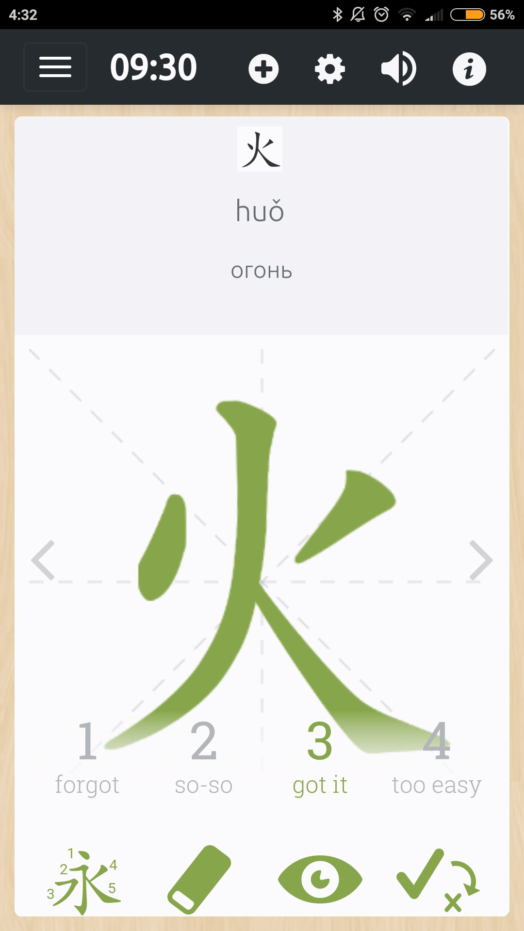
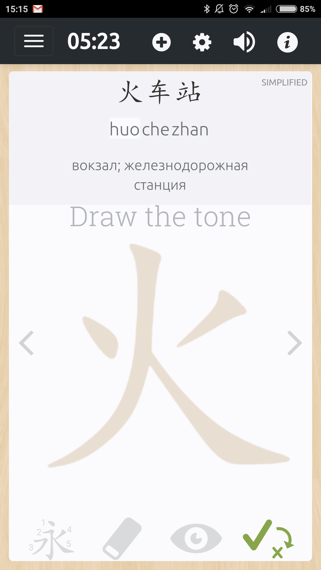
I have noticed that the writing prompt for 火 and the KaiTi character displayed above it are different: the left dot is written in different directions. Then I also noticed that the tone prompt shows it also differently (I guess it’t just a huge version of that KaiTi character):
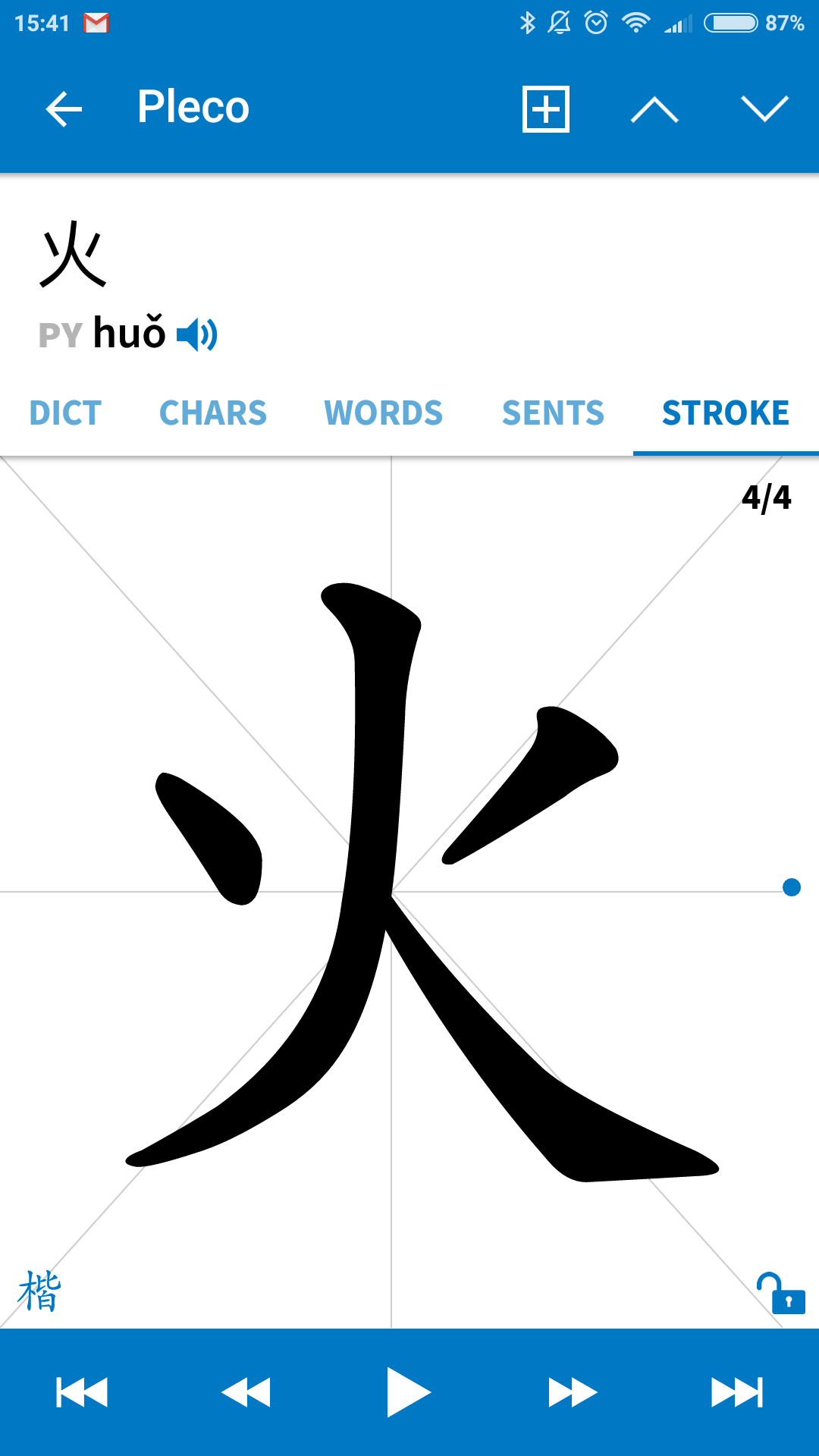
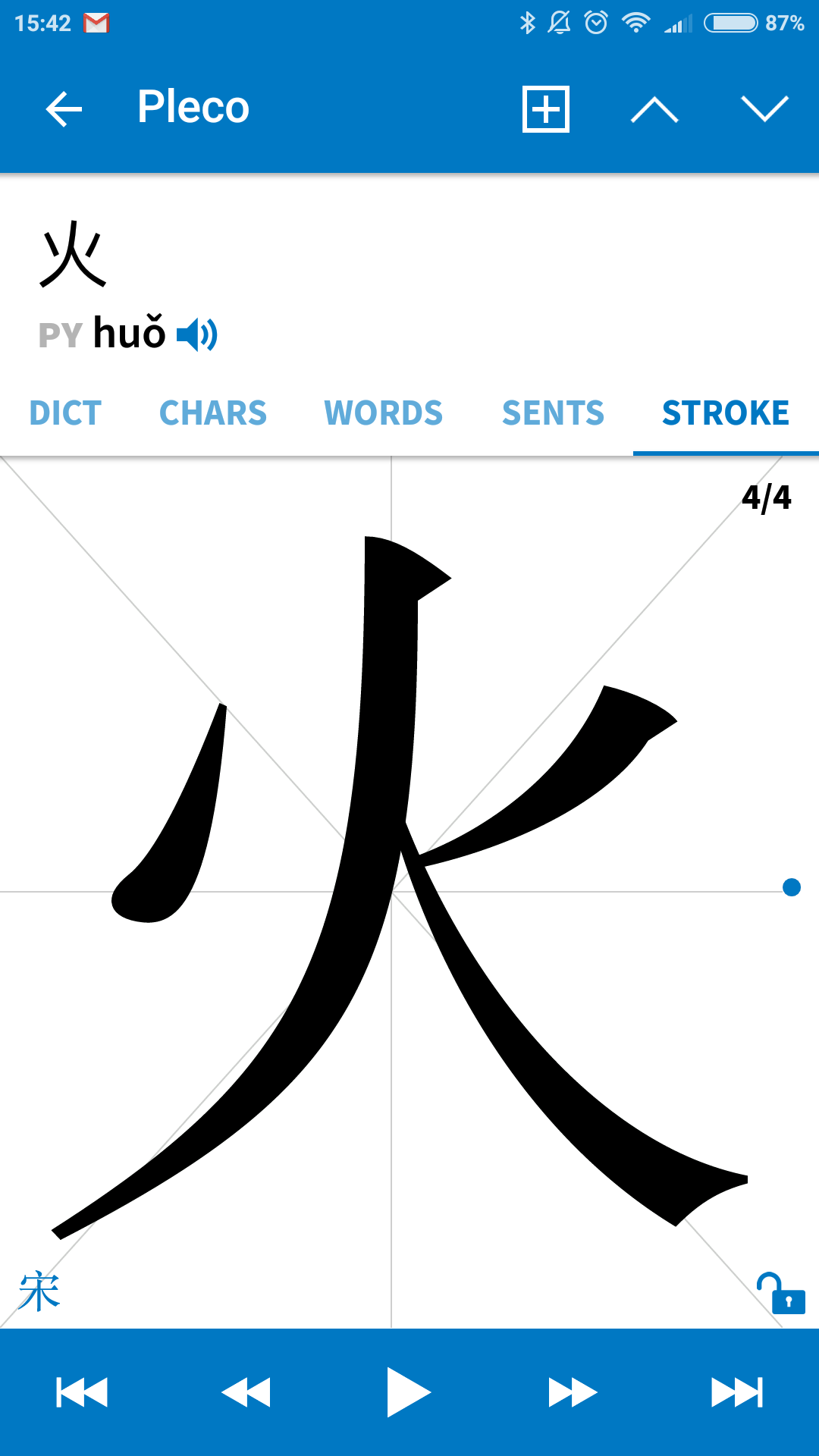
I started searching for the “right” way of writing it, but discovered that varies throughout all fonts and styles. Here is Pleco with KaiTi and SongTi:
And here is the stroke order from the wikipedia and wikitionary:

But even on those pages it varies, because in most HeiTi fonts the left dot stroke goes to the left (I’m not sure how this type of stroke is called correctly). But even among HeiTi-style fonts it varies. Some more links:
It’s also curious that the old scripts have these stokes symmetrical and in the Seal script they are “vertically oriented”.
Anyway, the bottom line is that whichever way is correct (or even if both ways are), I want it to be consistent in Skritter: either way, but the same throughout the app.
It’s okay if it will be different between KaiTi and HeiTi (that appears in the character info using the system font), but it should be the same at least in all KaiTi-looking appearances, i.e. including the writing prompt.